The Task
"Choose an app that you like and use often.
Select two main screens and describe their purpose and way the designers choose the current UX and design (in your opinion).
With the same screens/flows describe how you would redesign it and why. Using mockups/prototyping + explanation text."
Select two main screens and describe their purpose and way the designers choose the current UX and design (in your opinion).
With the same screens/flows describe how you would redesign it and why. Using mockups/prototyping + explanation text."
This work was done in September 2021. I extensively used the Israel Post's mobile application during the COVID-19 pandemic. It is likely that many things have changed since then.
⚠️ Important message:
Everything you see below are based on my subjective understanding of the Israel Post's mobile app. I'm sure there are many reasons and challenges behind the app that users don't know. Of course, there is a chance that I may have misinterpreted something.
So, if you are someone who was a part of work on this mobile app, please do not take anything here on personal, and I hope my mini research and feedback will be helpfull :)
Thank you for your work and special thanks to the Hayarkon 61 branch in Tel Aviv ❤️.
The Process & Result
I started the process by going over all the screens in the Israel Post mobile app that were available for my user persona. During this review, I noticed the most significant challenges, in my opinion.
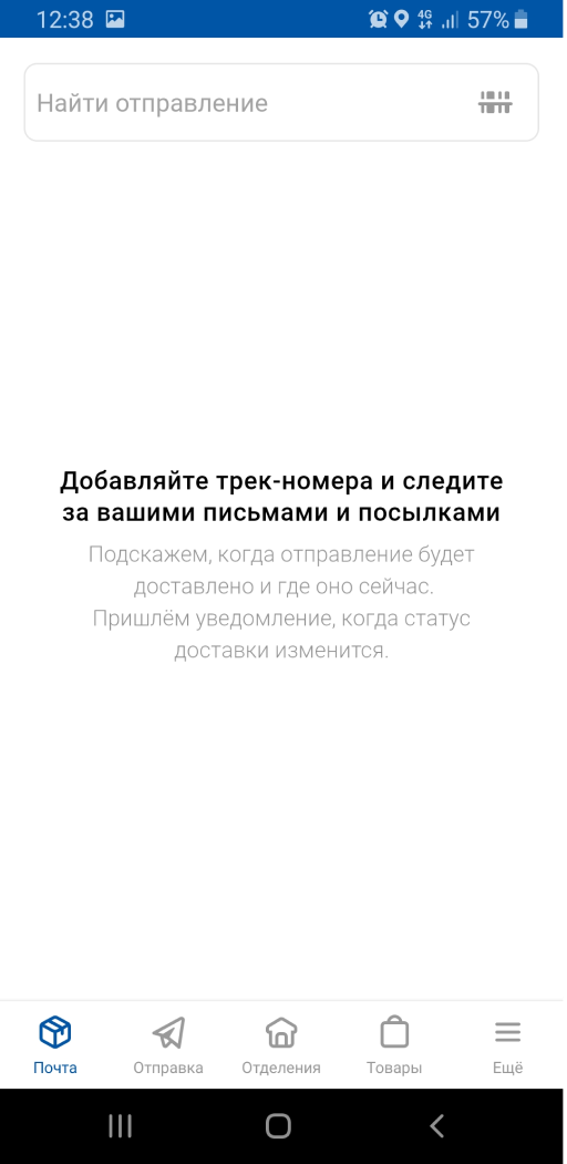
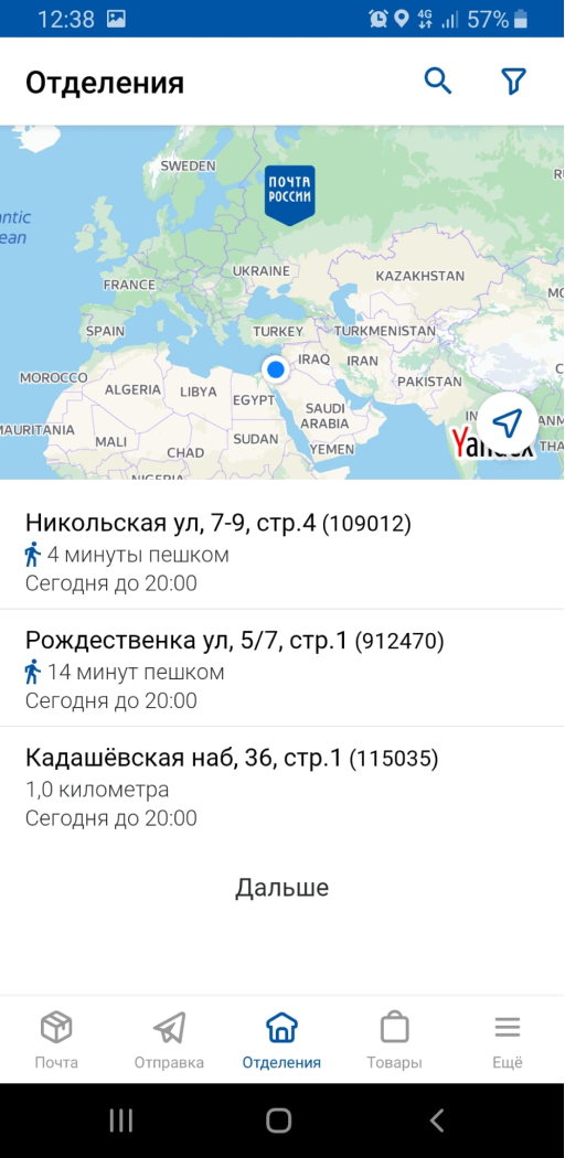
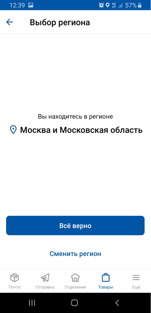
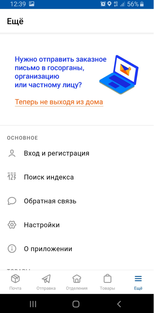
The next step was conducting a mini research on several mobile apps for postal services from different countries, where I attempted to register using my location in Israel.
After that, I created a low-fidelity application flow and sketched wireframes in my notebook.
The last but not least step is screen design and prototyping.
About Israel Post's Mobile App
Primary and menu screens
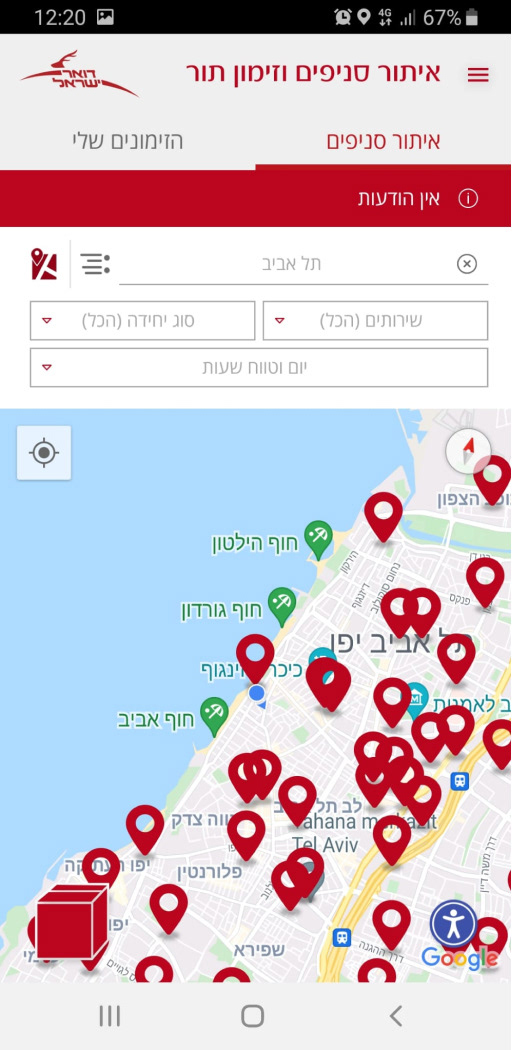
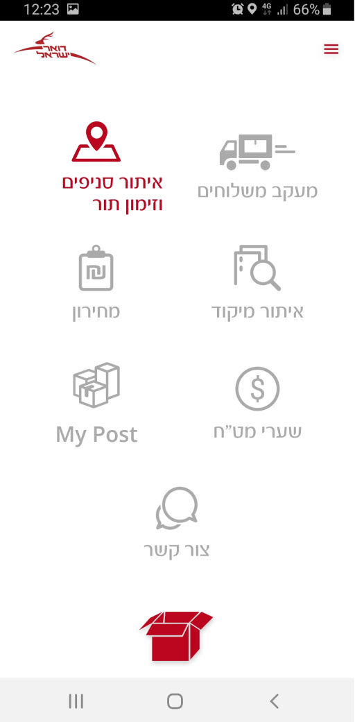
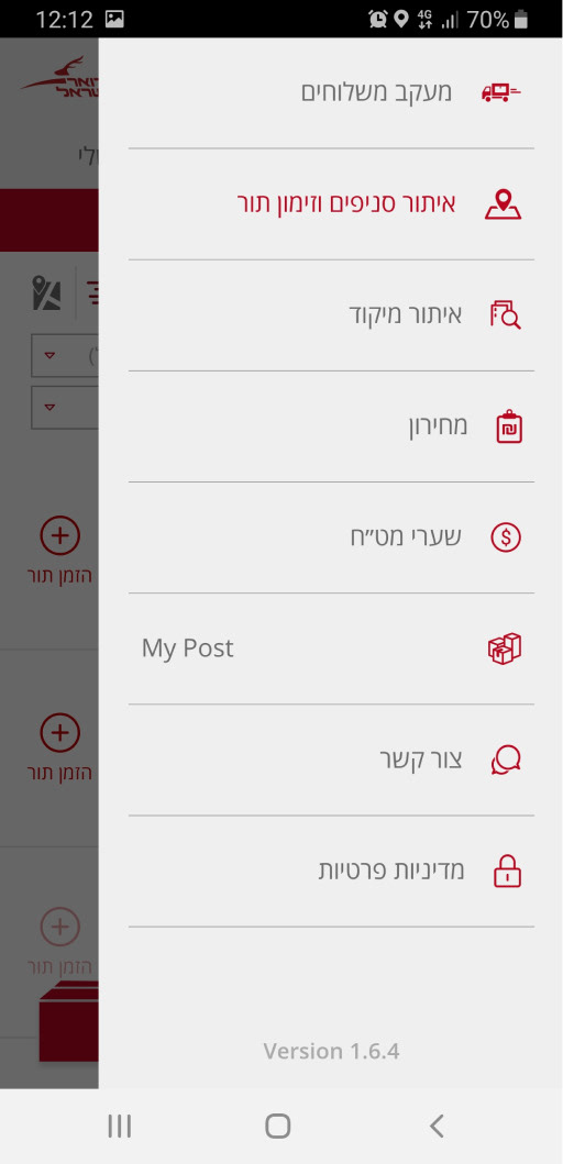
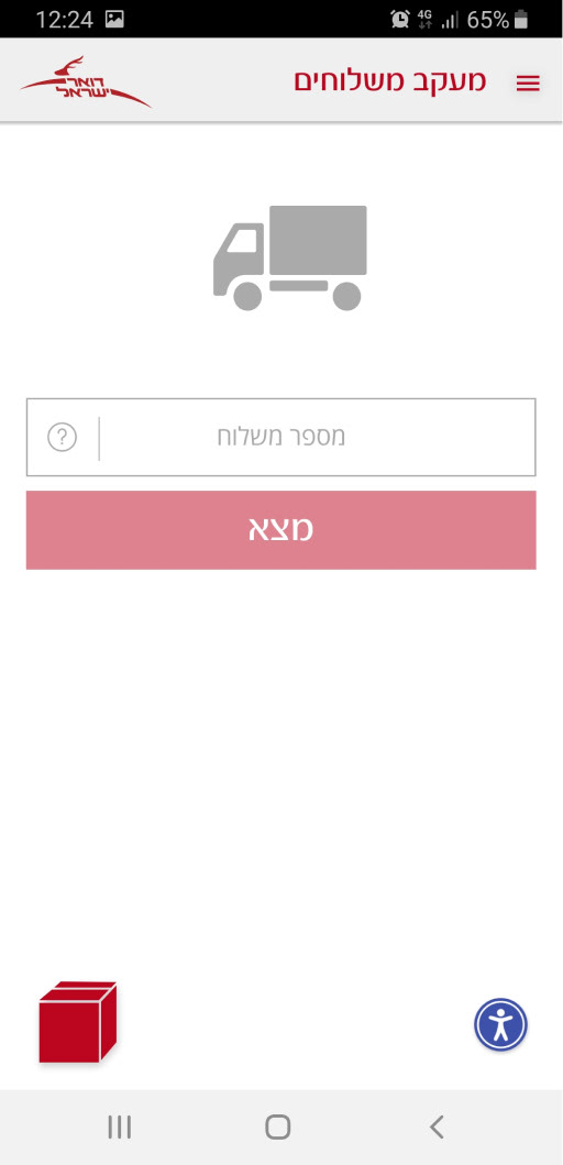
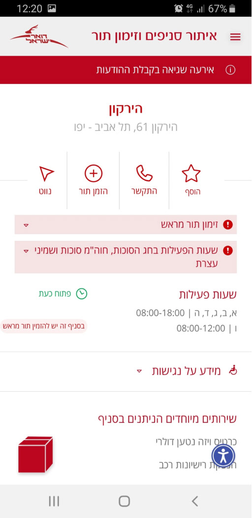

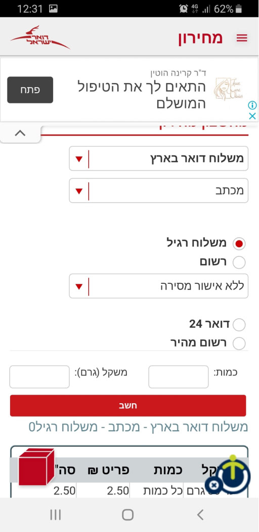

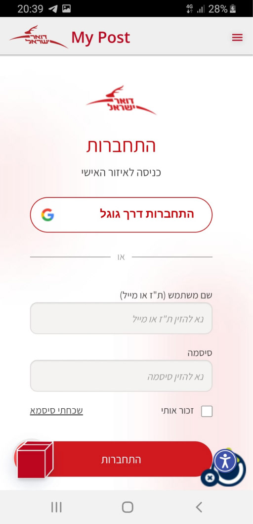

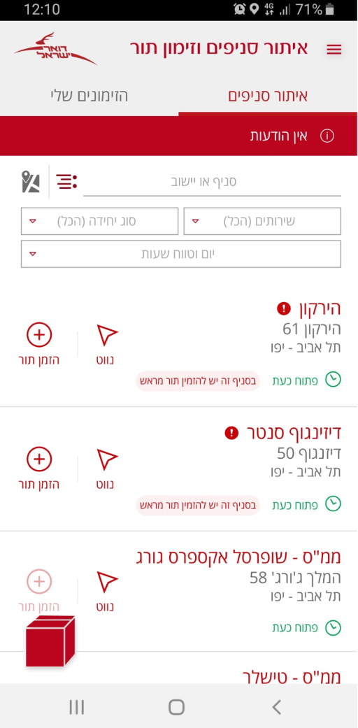
Locating branches and queue reservation

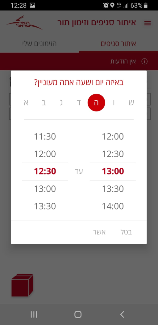

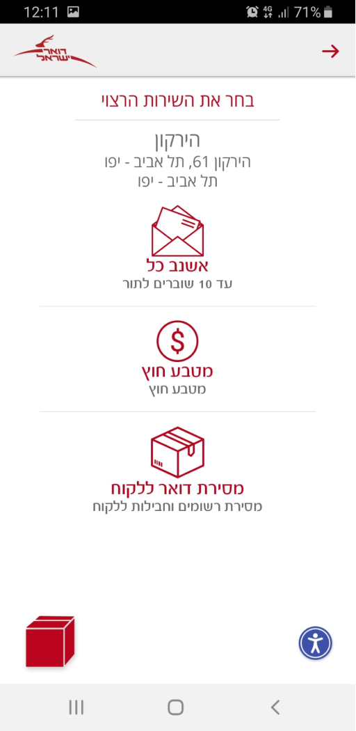
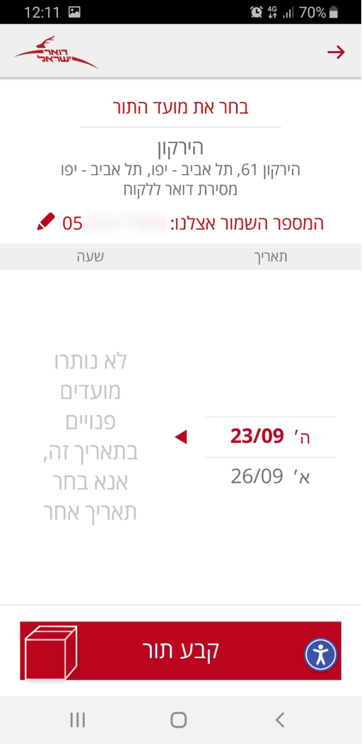
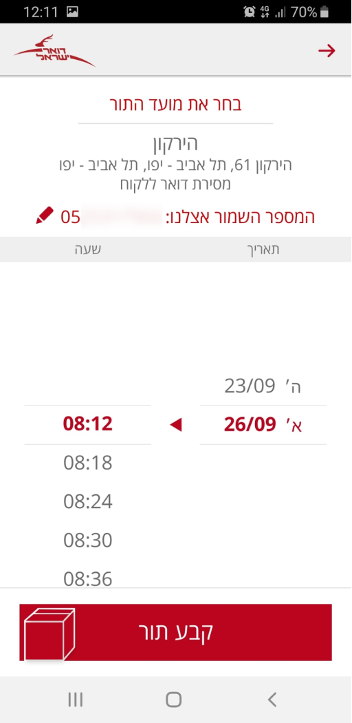
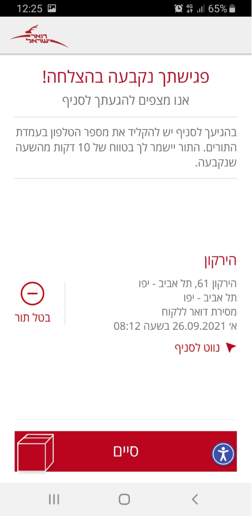
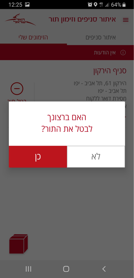
Make an appointment at the branch

The Challenges
Challenge 1.
Repeatability of menu items in hamburger and box-icon menus. It is required for the user to click on the icons in order to see both menus, which are hidden.
Alleged reason:
Perhaps the reason is to give the user more ways to find the function they want. Also maybe the designer wanted to make a creative menu in the shape of a box, which symbolizes the postal service packaging.
Solution:
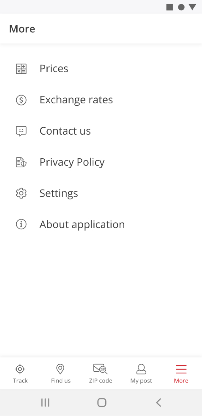
1. Make an open menu at the bottom of the screen so that the user can immediately see the options and it will be easier to find the desired action.
2. Remove the box icon.
Challenge 2.
A message bar takes a lot of screen space, and because it's red in my view it looks like an application error without the possibility to close it.
Alleged reason:
The color red is the color of the logo. The messages in this line may also be principal, but during my handling time (probably about one and a half years), it was always ״אין הודעות״.
Solution:
Move messages to the "My Post" section, it will save the screen place and won't look like a mistake.
Challenge 3.
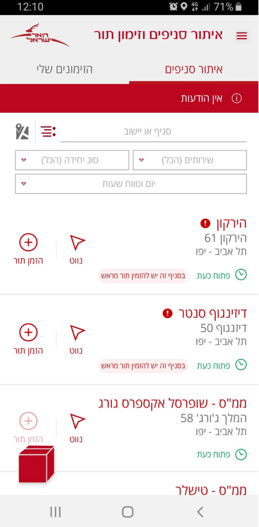
Section "Locations and queue reservation".
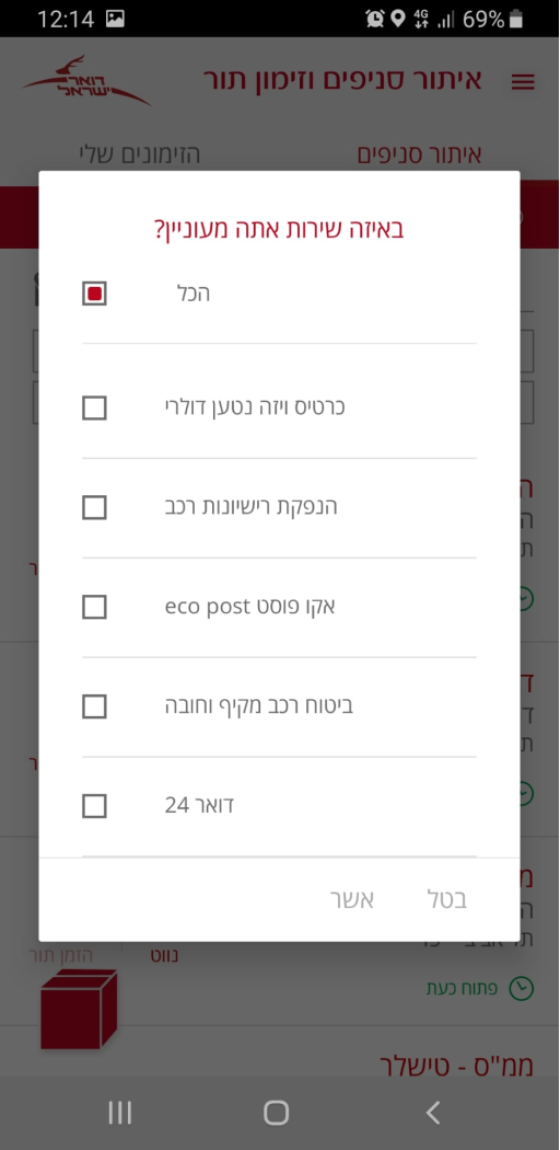
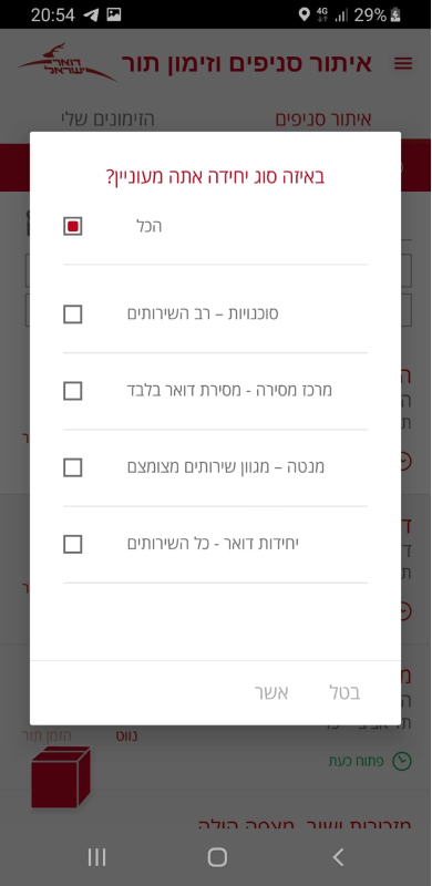
It was a confusing way for me to find services and time. There are 113 service options in the "Services" drop-down list and it takes a lot of time to scroll and find one.
In the "Day and Hour" field, the range between "from" and "until" specific time in my experience was not clear.

Alleged reason:
Maybe for designer 113 options seemed like a shortlist, or maybe at the beginning there were fewer options, and after the launch, more services were added. As for the field "Day and Hour", perhaps this is due to the difference in languages and because the numbers are read from left to right, it seemed obvious.
Solution: In the field "Services" add the ability to search with auto-correction and auto-completing. In the "Day and Hour" field, add the syllable "from" to the syllable "until".
Solution: In the field "Services" add the ability to search with auto-correction and auto-completing. In the "Day and Hour" field, add the syllable "from" to the syllable "until".
Challenge 4.
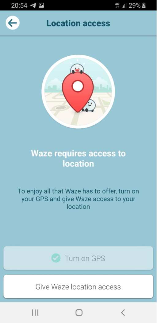
Section "Locations and queue reservation" - "Directions".
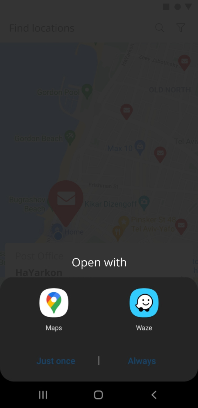
When the user clicks on "Directions", it opens the "Waze" app. Some pedestrians use "Google Maps" more (like me for ex.), and it might be not comfortable.
Alleged reason:
Maybe the designer decided that the "Waze" was enough or the reason is some kind of development limitation.
Solution:
Provide the user with an opportunity to choose from the navigation apps installed by him ("Google Maps", "Waze").
Challenge 5.
Section "Locations and queue reservation" - "Post Office" screen.
There is a star icon on the 'Post Office' screen. When it is pressed, only the text changes. For me, it was not immediately clear.
Alleged reason:
Possibly, the designer decided that the text changes alone were sufficient or it's just limitation of design system.
Solution:
Change icon to "pressed" view.
Challenge 6.
Section "Locations and queue reservation" - "Post Office" screen.
Every day in each department, there are certain peak hours. Upon arrival during these peak hours, even if you have a queue reservation for a specific time, you may have to wait longer due to overcrowding. Considering the concerns regarding the coronavirus, not all users want to be in a crowded environment.
Alleged reason:
Perhaps this question was not relevant during the design phase.
Solution:
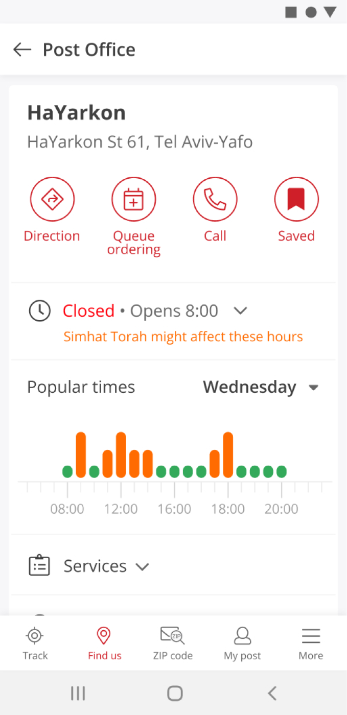
Add information about the department's workload.
Challenge 7.
There is a lot of red color in the application, and some details appear to be errors.
Alleged reason:
The designer was guided by the color of the logo.
Solution:
Change the colors of the titles and icons to the dark gray text color. Use a larger/bold with a dark gray color font instead of red color font to highlight the elements. This will make the screen look more harmonious, cleaner, and calmer.
Challenge 8.
In the "Locations and queue reservation" section, there are two tabs: "Find Branches" and "Queue Reservation". In my opinion, they do not match and occupy additional screen space.
Alleged reason:
To ensure users remember when they ordered a queue.
Solution:
Move the "My post" section to my calls.
Challenge 9.
Section "Locations and queue reservation". For me the meaning of the list-icon was not immediately clear. Map-icon is small and not immediately noticeable.
Alleged reason:
To save screen space.
Solution:
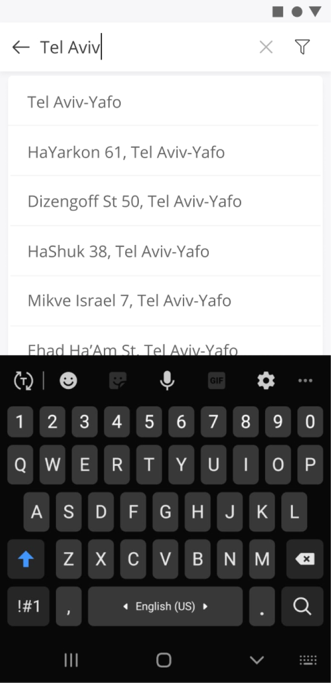
Combine map and list view. Or replace the search and filter fields to the top of the screen and change them for relative icons.
Challenge 10.
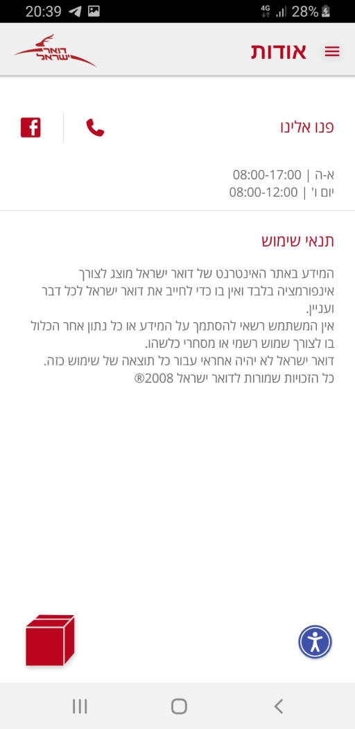
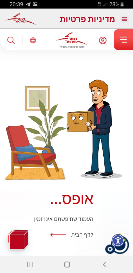
Some screens, such as "My Post" and "Privacy Policy", aren't app's screens, but as a browser display of the pages of the website https://israelpost.co.il. In my point of view it’s less comfortable to use an app.

Alleged reason:
Saving time for the design and development team, possibly running out of budget.
Solution:
In my view, although the Privacy Policy can remain as a page on the site (which was not working at that moment), it is essential to add the "My Post" section to the app.
The Research
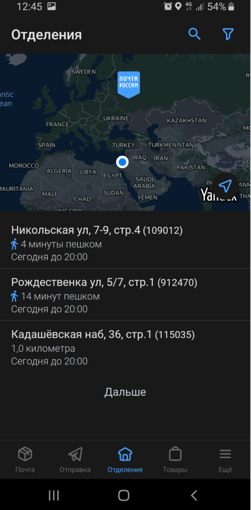
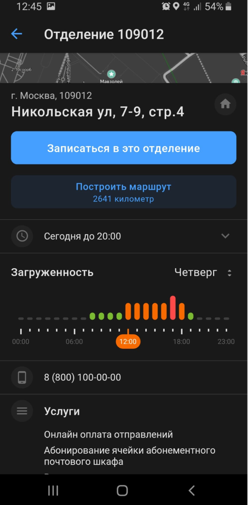
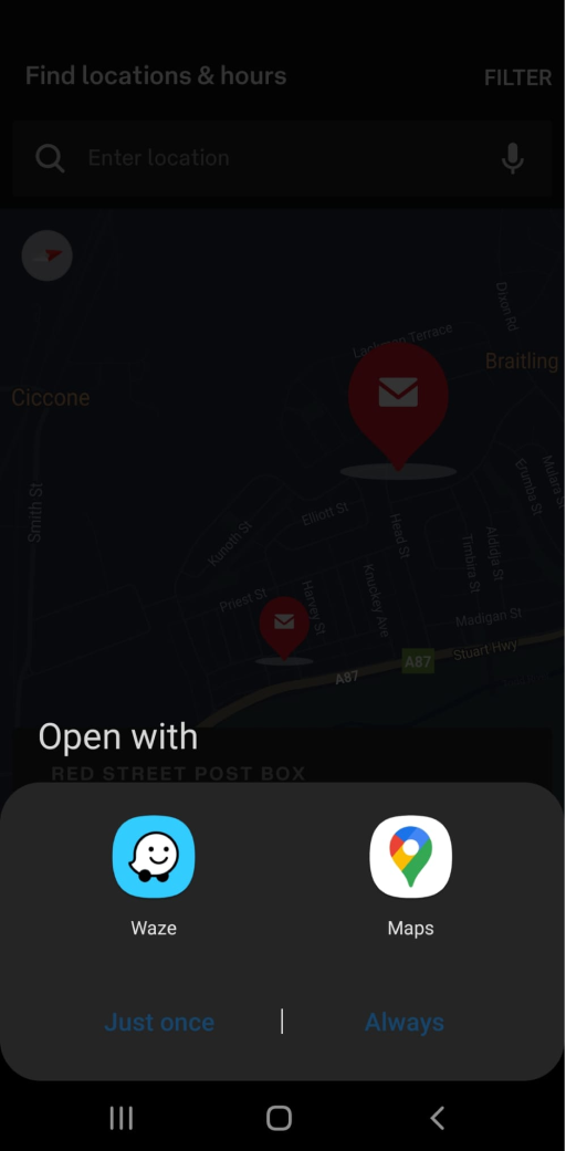
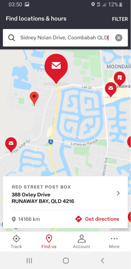
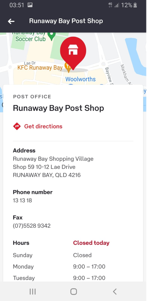
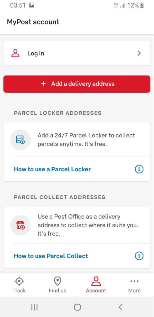
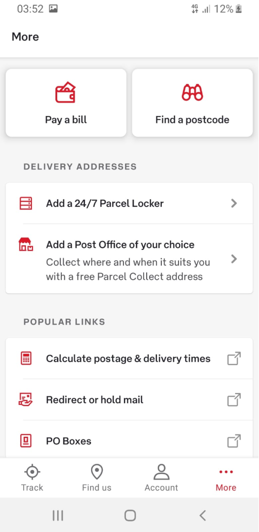
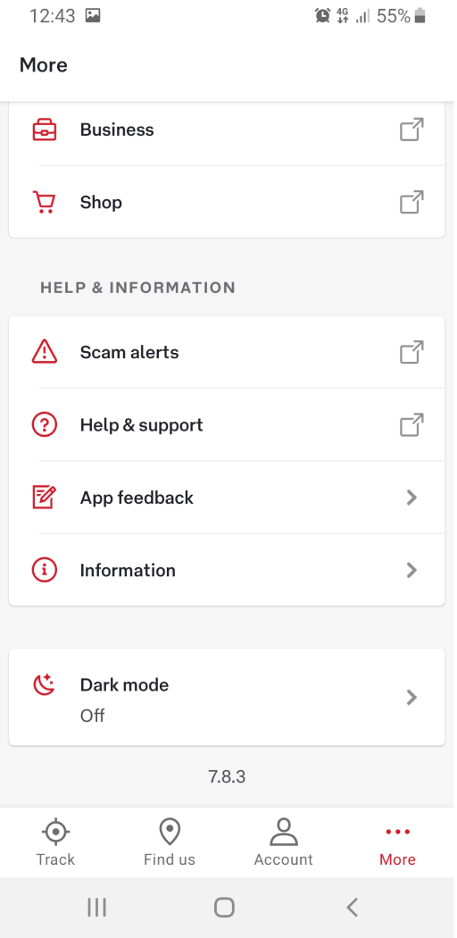
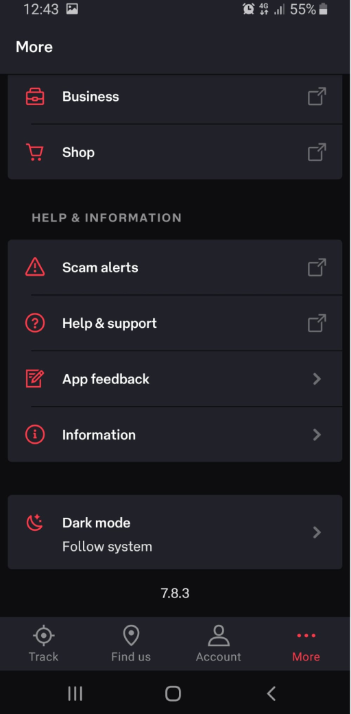
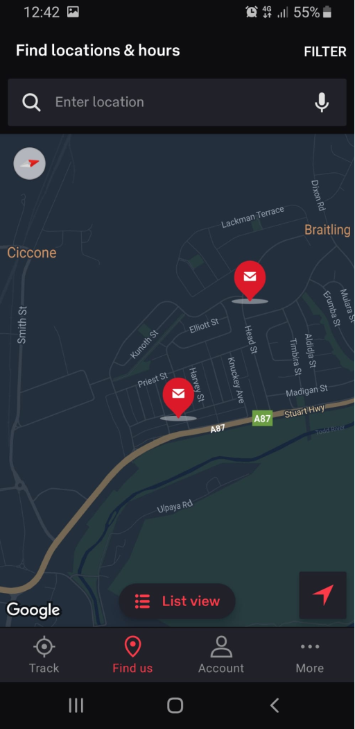
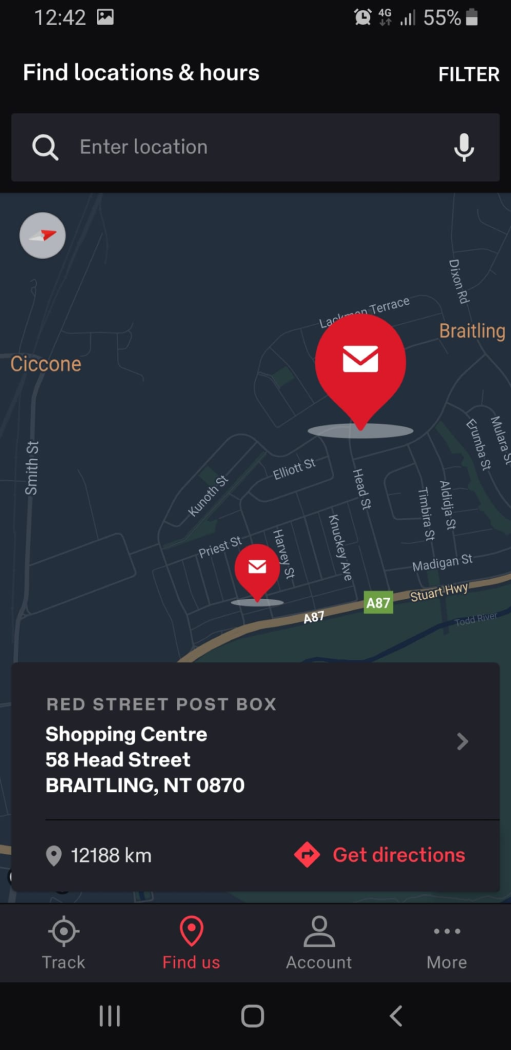
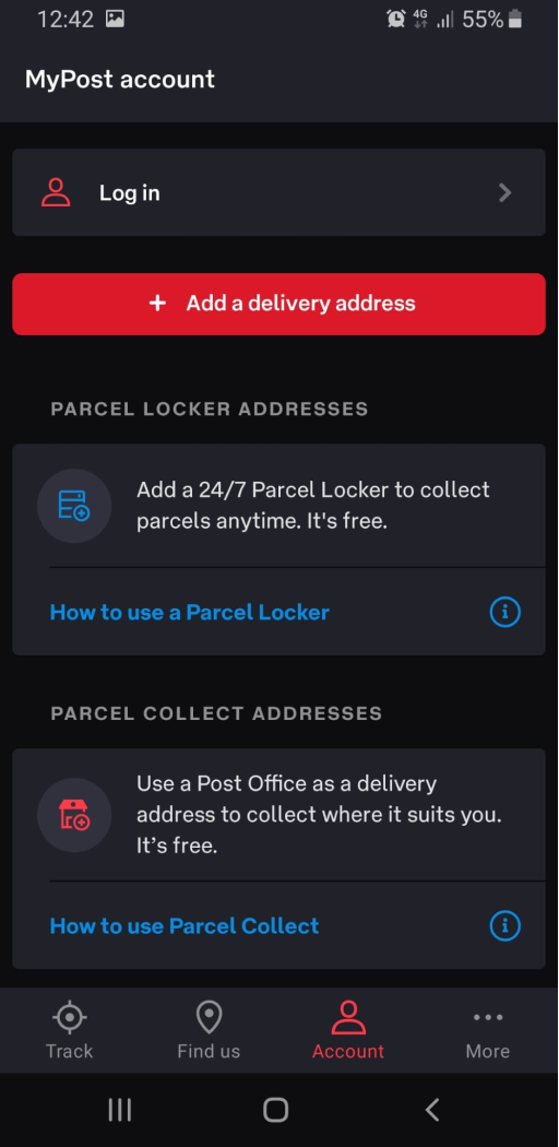
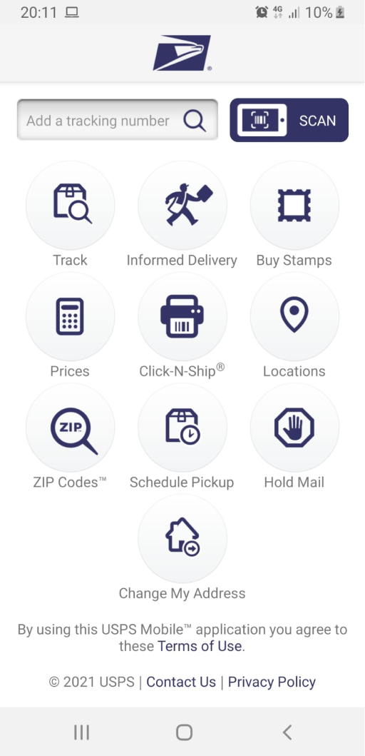
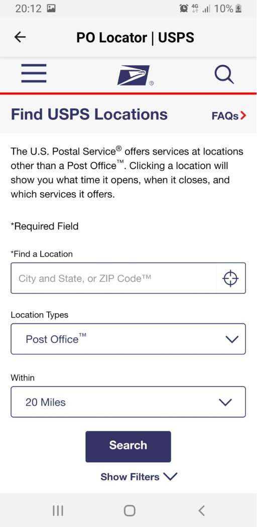
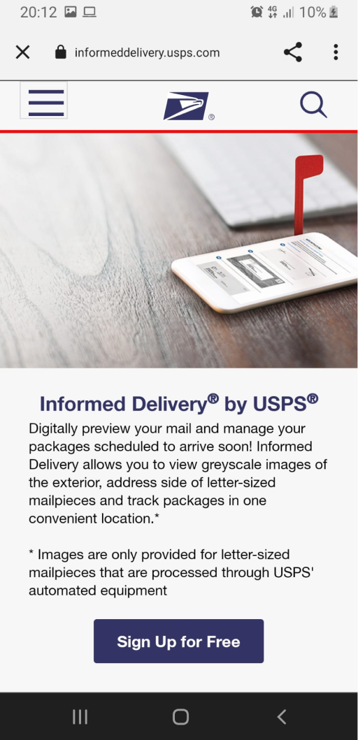
I did a mini research on several mobile apps for postal services from different countries where I was unable to register using my location and data.
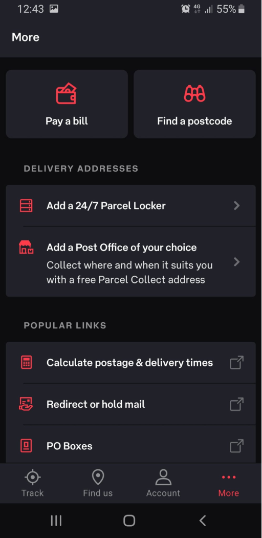
Here are some of these apps:
Russian Post
Light Theme
Light Theme
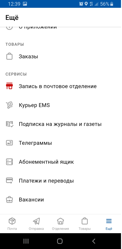

Dark Theme

Australia Post
Light Theme
Light Theme

Dark Theme

USPS Mobile

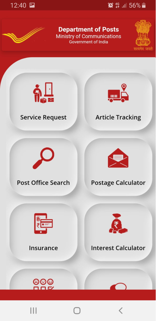
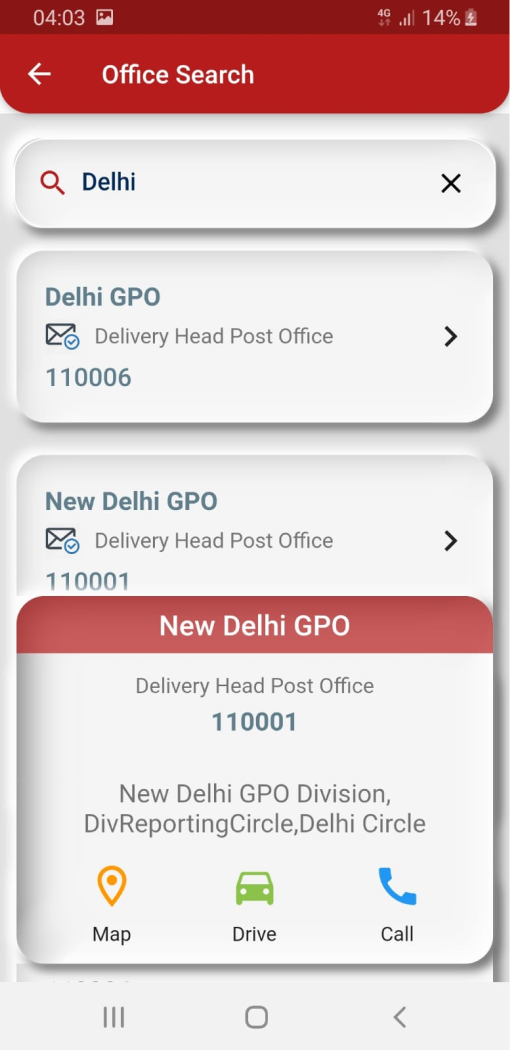
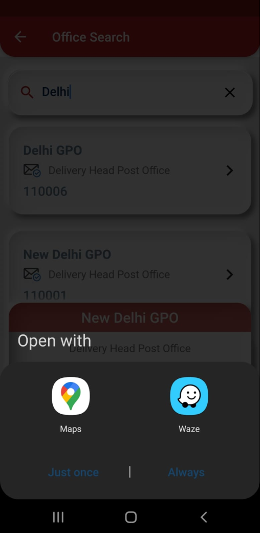
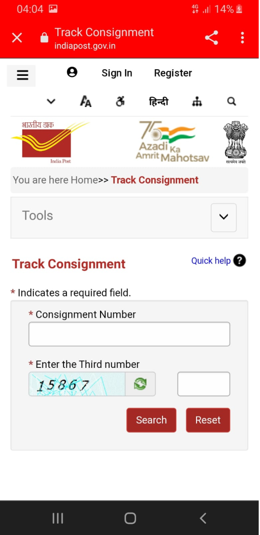
PostInfo by India Post

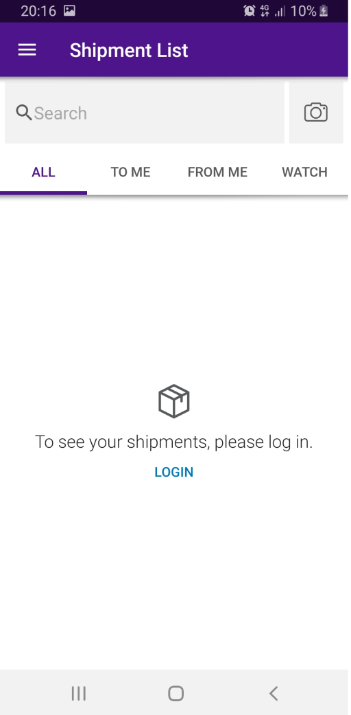
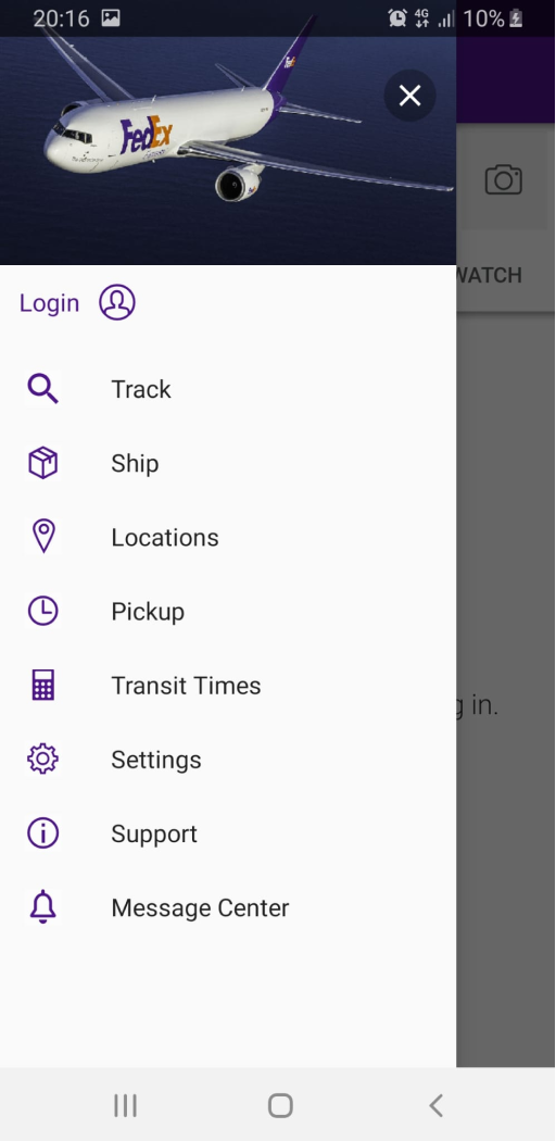
FedEx


Application Flow & Wireframes
Low fidelity application flow
Low fidelity wireframes
UI Screens & Prototype
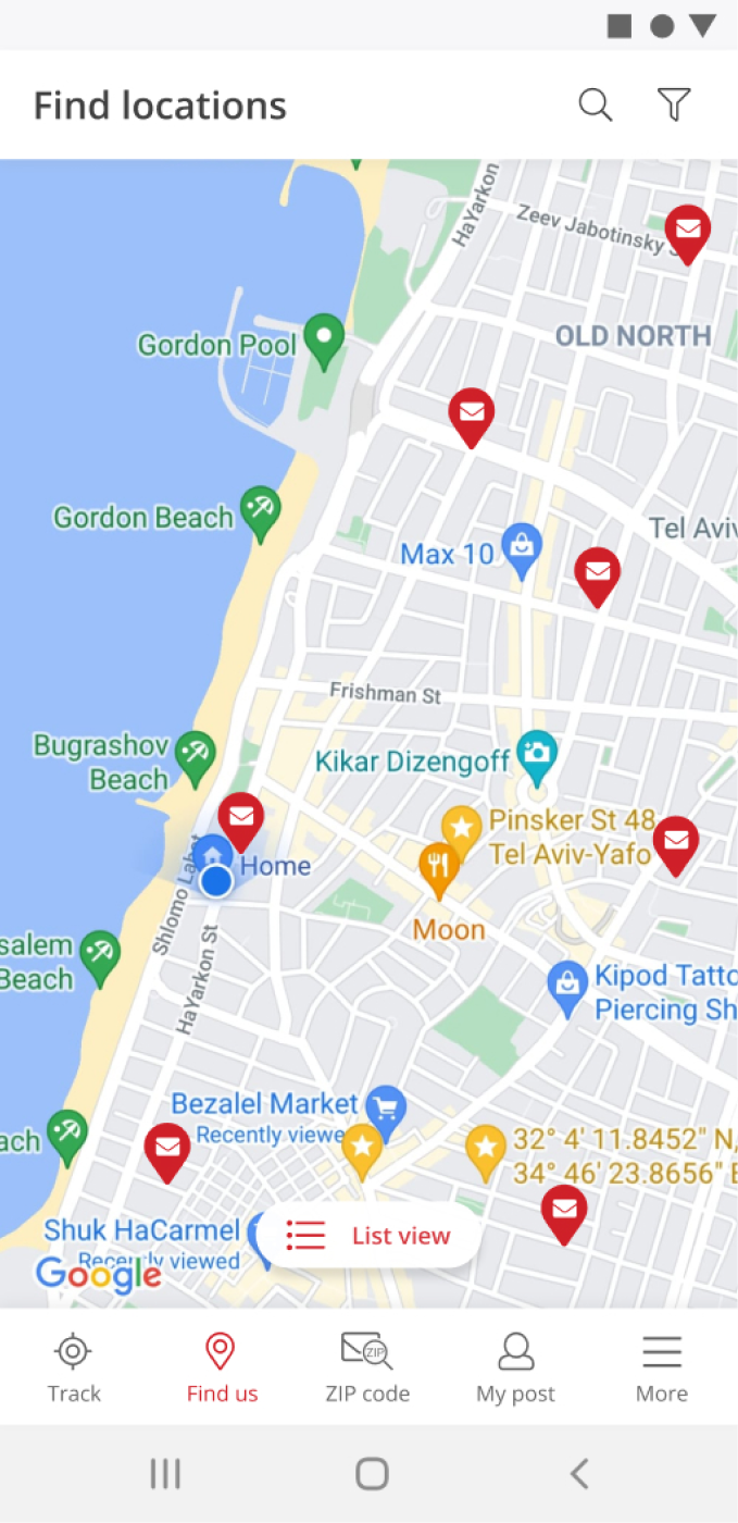
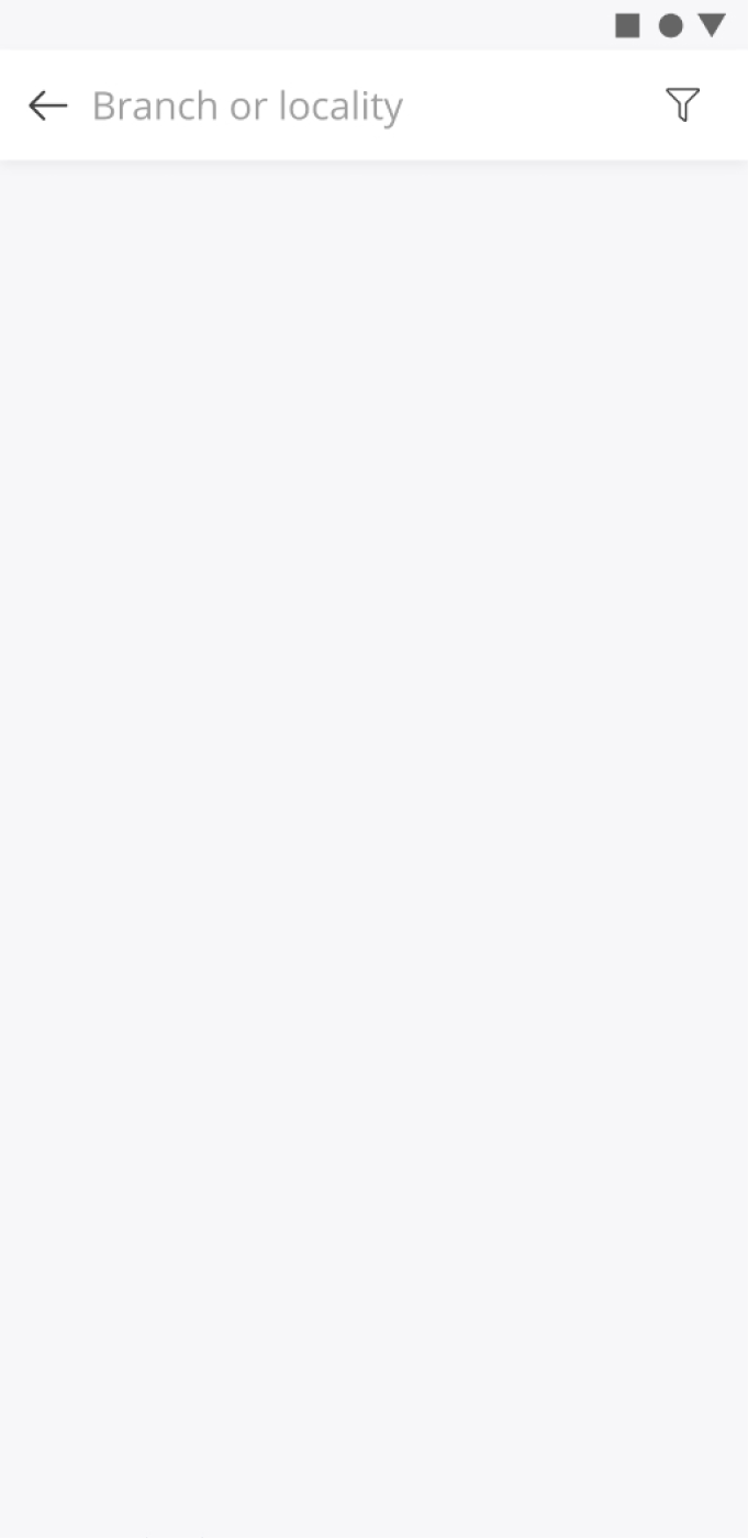
I created several UI screens for Android and tested them on my Galaxy S8. As a result, there is a navigation panel at the bottom of the screen relative to its content.
UI screens



Prototype Video


